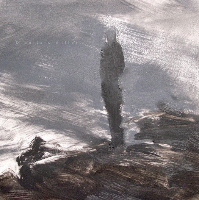
Can any painter do anything blurry without thinking of Gerhard Richter?
paintings
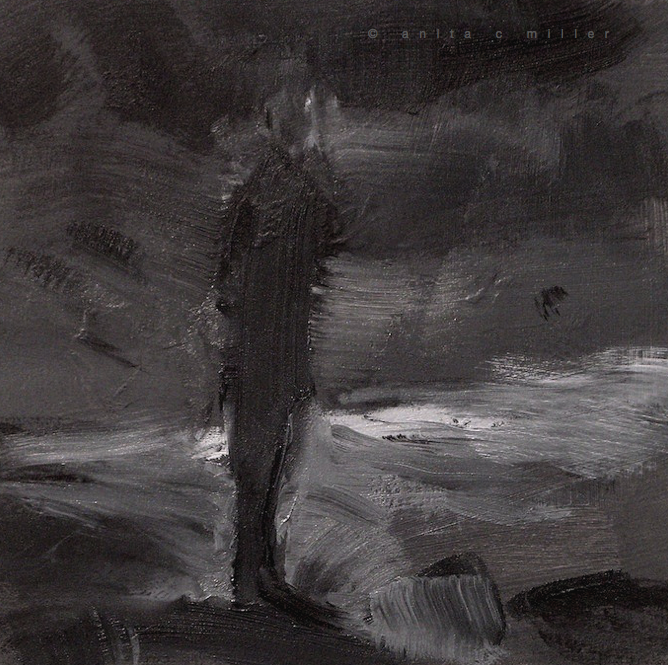
Can any painter do anything blurry without thinking of Gerhard Richter?
A fast and fun palette knife painting.


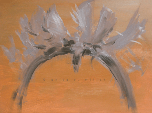
The driver of our tour bus shouted “Caribou ahead!” and we all reached for our cameras! What a stroke of luck that I was sitting on the left side of the bus and had THE perfect view as the beast ambled by! 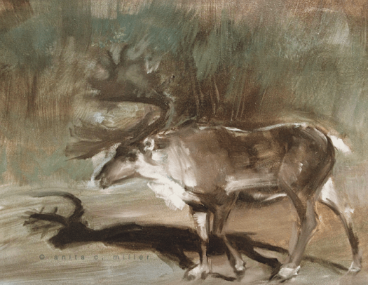

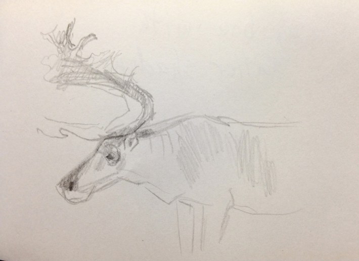
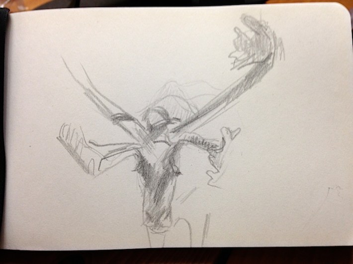


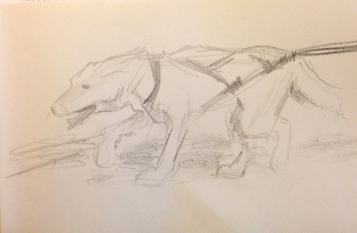
A very quick sketch. I’m not sure how to depict these antlers – they are so interwoven. This was my favorite thing in Fairbanks. I just did not find the town that interesting and we were sorry we spent an extra night there before meeting up with our group to begin the trip. Our hotel was a little ways outside of town and not near anything in walking distance. We had to take the hotel shuttle everywhere. The driver was very nice but, a bit down on the place and said that alcoholism is a real problem. He was not a native, though, and I can see where winter would drive you crazy in this place. We had long days there — it didn’t get dark until 11 PM! If you talked to the shuttle driver who was native, you got rave reviews for the place. I still don’t understand how they survive the cold and dark of winter, though.

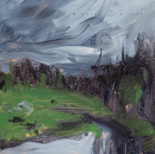
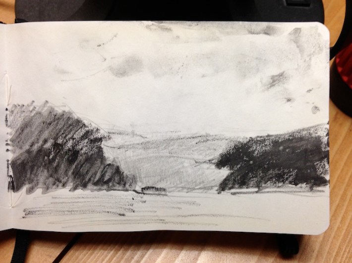
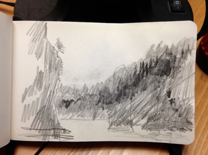
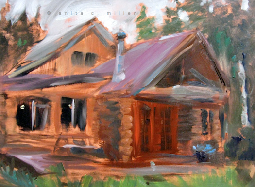
My husband and I had a wonderful trip to Alaska. I’ve been doing a lot of new paintings based on photos I took there.
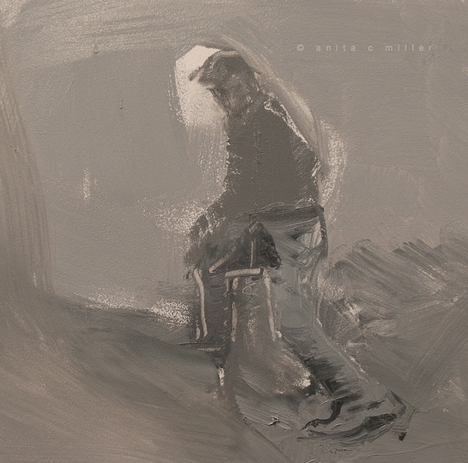
Initial block in


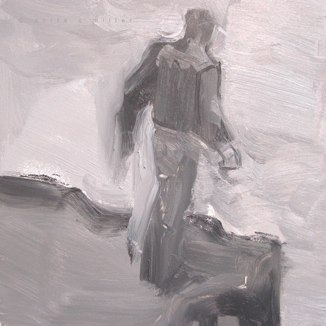
A few stages of the painting.

The whole study was done in about an hour. The usual palette was used and the gessobord was coated with a dilute mixture of cadmium vermillion and sevres blue (which was dry before I began the painting). This gives a nice warm undertone that shows through.

See you all in September. Have a great rest of the summer everybody!

 Yesterday’s painting with photo used, my set up in the studio, and stages of the painting.
Palette: the usual (cad. yel. lt., cad. red verm., quin. mag., ultra blue, sevres blue, burnt umber, tit. zn. white)
Total time: about 1 1/4 hr.


 palette: cadmium red verm.,sevres blue, quinacridone mag., ultramarine blue, *burnt umber (new addition to palette), white
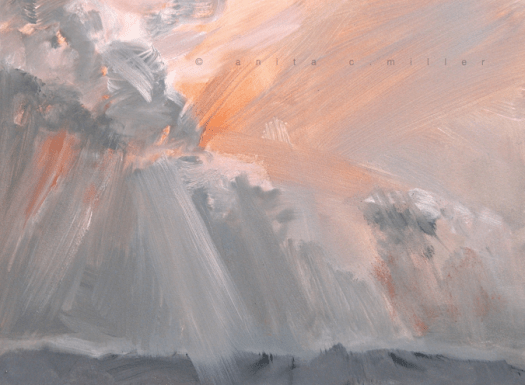
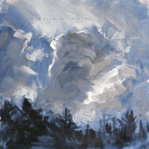
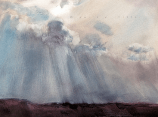
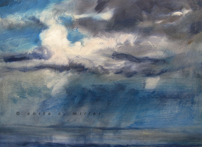
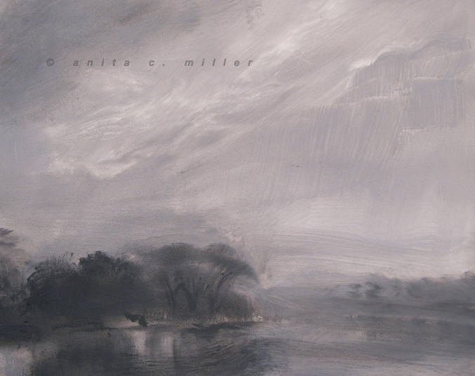
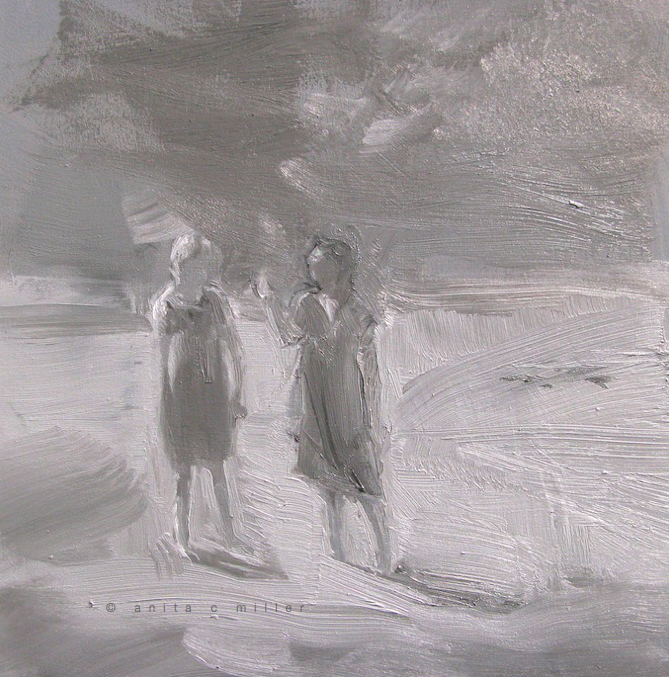
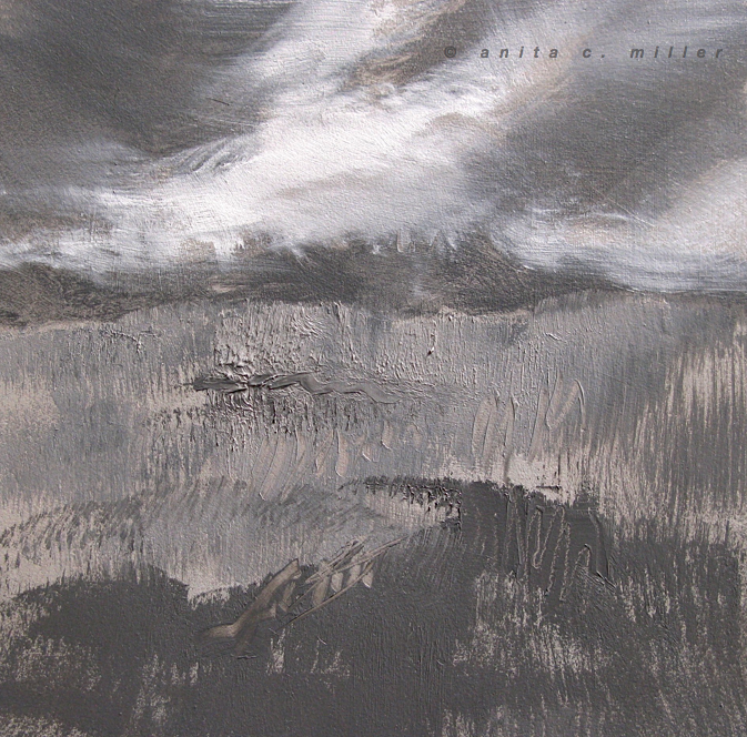
palette: graphite grey, portland grey (lt., med., dk.) sevres blue, cadmium red vermillion and white. The first of two sky studies.

One more of Domino… just a quick, fun study.

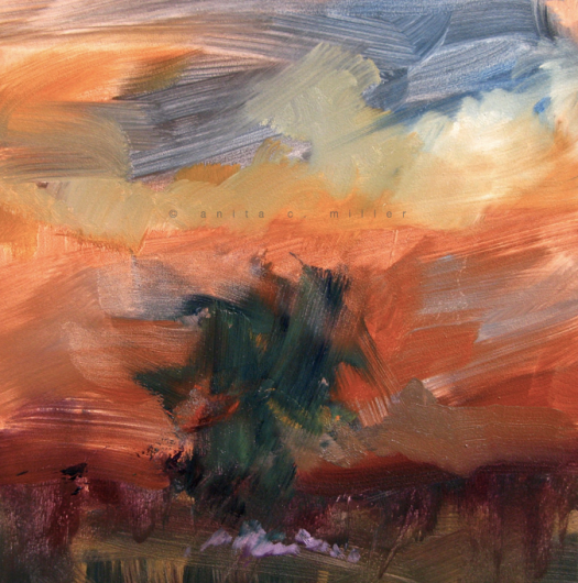
Based on a photo of a single tree (not sure what kind) in the middle of the prairie (see photo below). The sky is from my imagination. The same palette as yesterday was used. We had a glorious afternoon hiking in this preserve last weekend : )

palette: cadmium yellow light, quinacridone magenta, cadmium red vermillion, ultramarine blue, sevres blue and white. Initial warm tone of vermillion plus some sevres blue (applied as a wash). This one was not quick like yesterday’s. I had to scrape a lot off at one point because I was painting too many details.


oil on archival panel
© Anita C. Miller 2013
After spending an hour on this, the painting was accurate, but lacked movement. So, I started taking “swipes” at it pretty much out of desperation to make something happen. I think it has some energy to it now, so I’m happy.
oil on archival panel
© Anita C. Miller 2013
I decided to try the mirror image of yesterday’s painting. I also included the first stage of the painting.
 oil on archival panel
© Anita C. Miller 2013
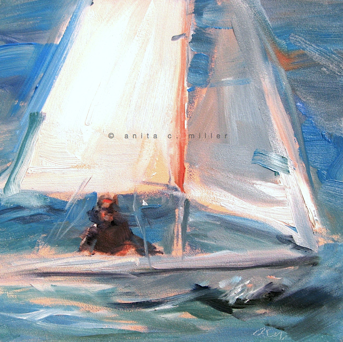
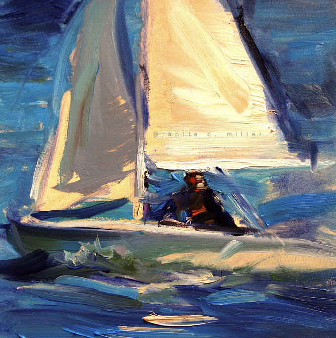
I’m continuing to experiment with color (a different palette) and brushes. Palette used: cadmium yellow light, cadmium red vermillion, quinacridone magenta, ultramarine blue, sevres blue and zinc titanium white. Painted alla prima in about 45 minutes. The brushes used are my new Silver Bristlon (brights) which I am loving.
Also, before starting the painting, I brushed a thin warm color over the entire panel, then wiped most of it off. This toned the surface so that I wasn’t painting on white. I left some of this color show through on the sails and the right side of the hull.

oil on archival panel
© Anita C. Miller 2013
___
oil on archival panel
© Anita C. Miller 2013
___
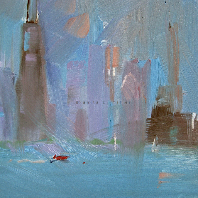
Hancock building (left side) and Trump Tower (right side).

oil on archival panel
© Anita C. Miller 2013
___
Yesterday’s photo of Trump Tower reflecting the afternoon sun inspired this little painting. I painted only a very small part of the photo and took some liberties — which is pretty much always the case : )
Palette used: titanium zinc white, cadmium yellow light, cadmium red vermillion, quinacridone magenta, ultramarine blue, phthalo blue and graphite grey mixed with some white to make a light cool grey.
oil on archival panel
© Anita C. Miller 2013
___
All of a sudden I’m painting with lots more color and using thicker paint. I can’t really explain why except it truly feels like summer and things should be more colorful. I’m also using some new synthetic bristle brushes which I like a lot. They’re Silver Bristlon (brights) in various sizes and I got them online from Dick Blick.
oil on archival panel
© Anita C. Miller 2013
___
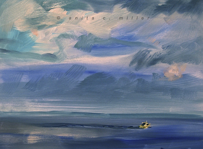
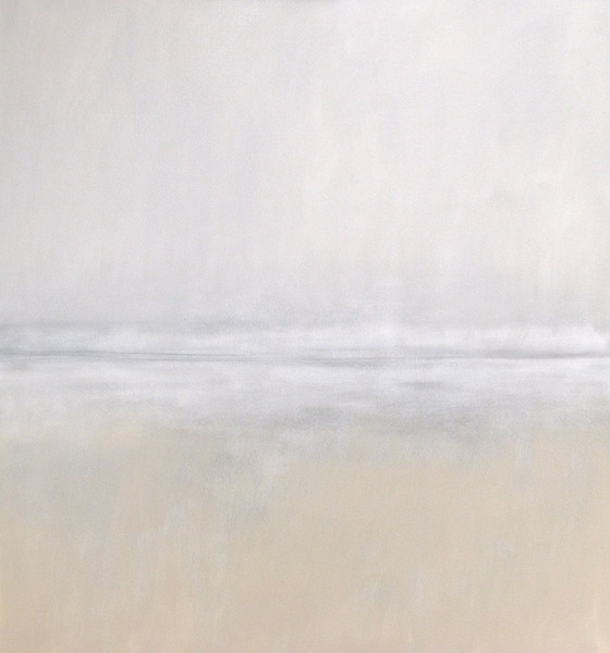
I love walking along the lake in the late afternoon and seeing light on the clouds and water… everyday it looks different.
oil on archival panel
© Anita C. Miller 2013
___
Happy 4th everyone!
Later, when it gets dark, we’ll go to the lakefront
and watch the fireworks which are shot from a barge.
~~~
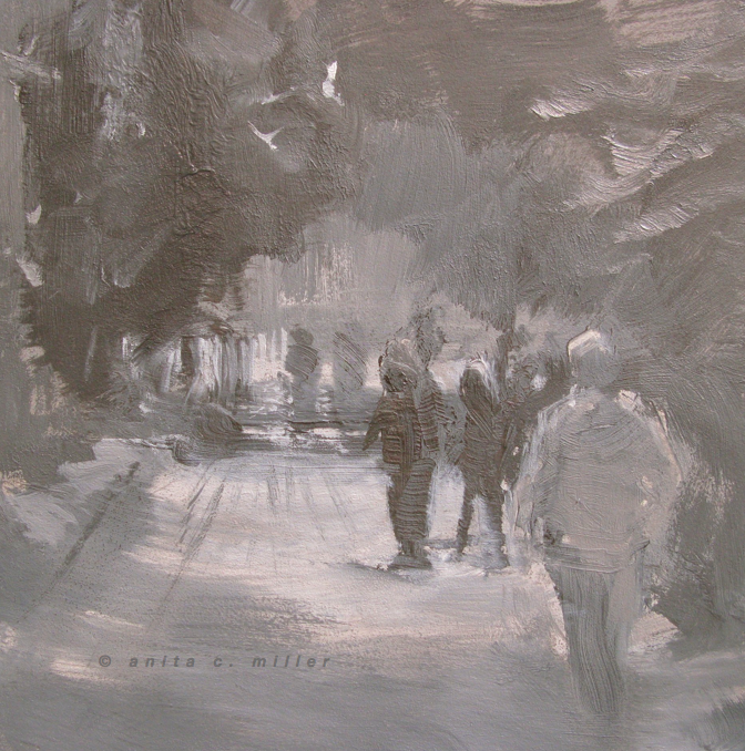
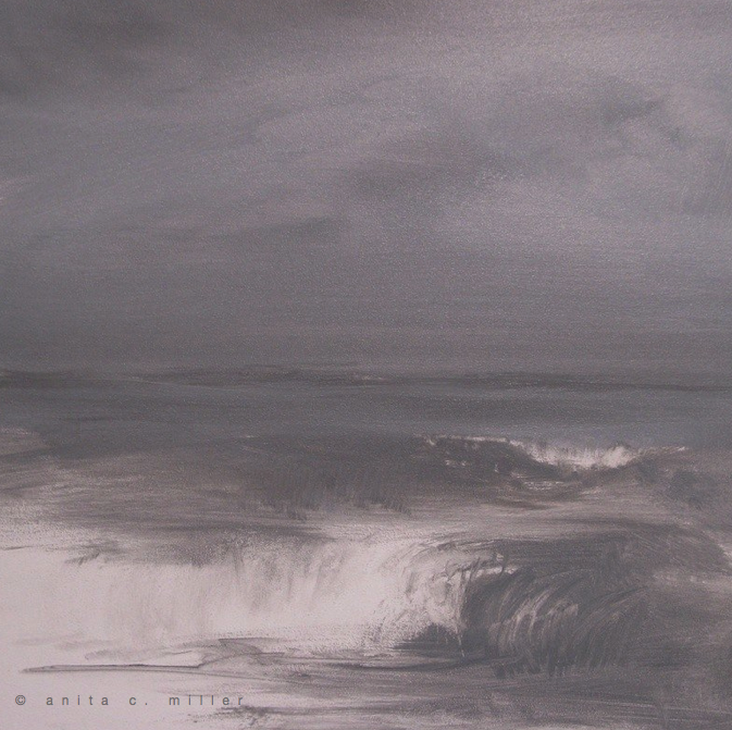
I loved using several blues here.
Colors used: all the Portland greys, graphite grey, sevres blue, ultramarine blue,
cadmium yellow deep, rose dore, and zinc titanium white.
I started by brushing a light glaze of Portland grey light over the
entire panel, then painted into the glaze with the other colors
alla prima and finished in under an hour.
I tried to not blend the brushwork too much in order
to keep it fresh and moving.
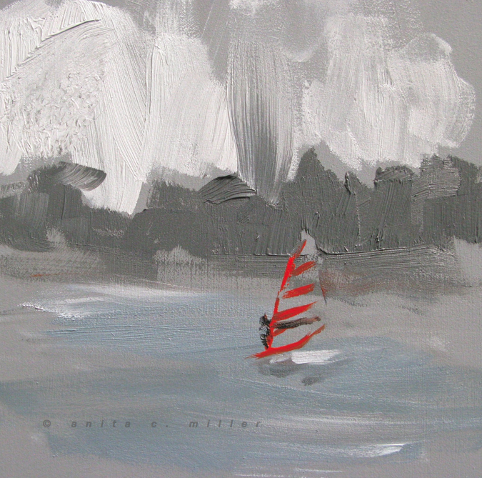
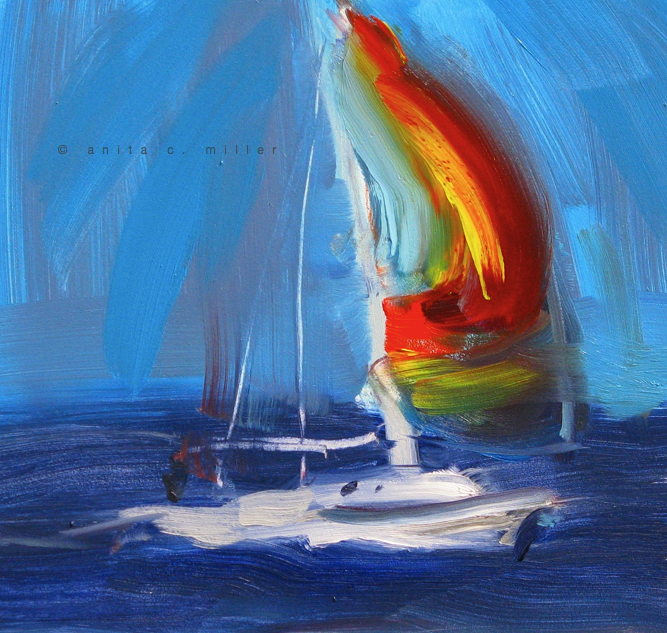
“Red Sailboard”, oil on archival panel, 5″ x 5″
___
“The Red Buoy”, oil on archival panel, 6″ x 6″
___
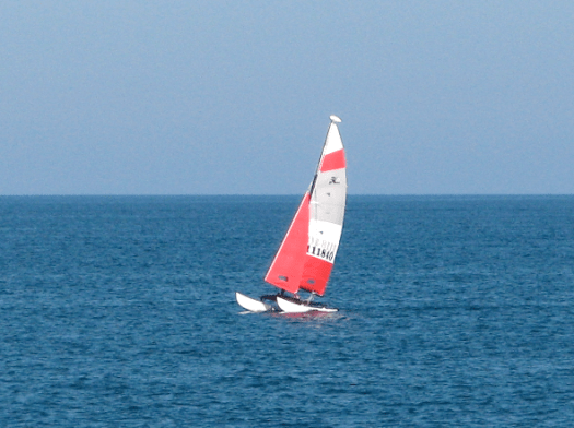
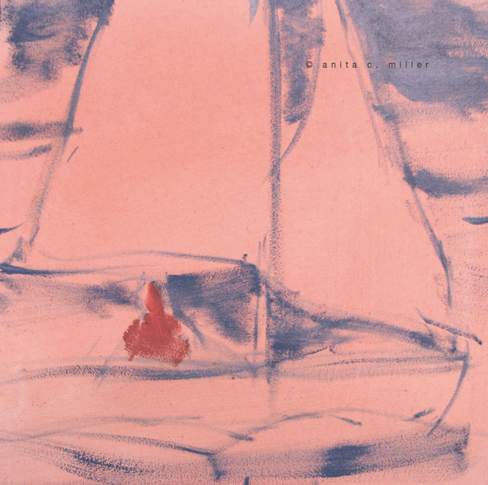
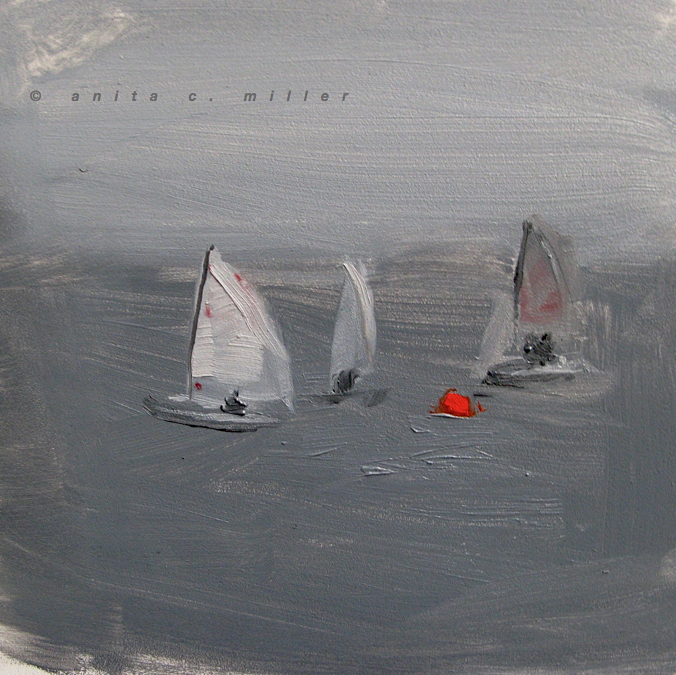
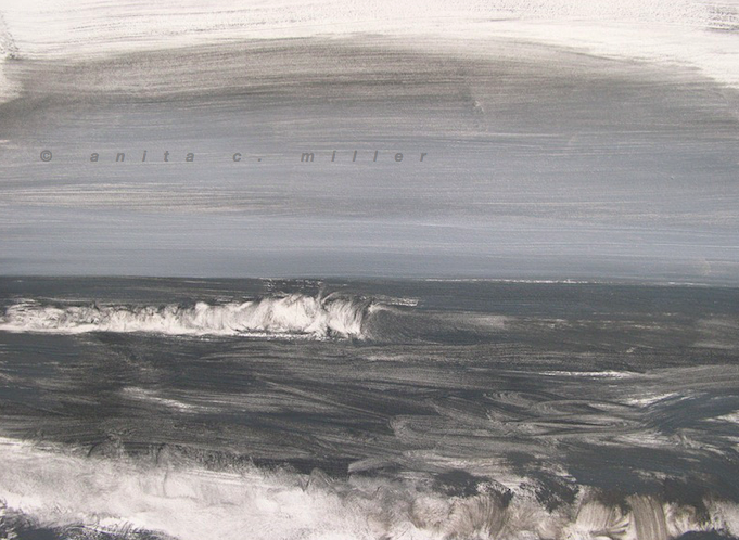
The three sailboats were practicing turns around a buoy off of
Northwestern University (where there is a sailing club).
I had fun putting touches of very bright red into these monochromes.

oil on archival panel
© Anita C. Miller 2013
___
I’ve started to think about adding a bit more color back into the paintings.
oil on archival panel
© Anita C. Miller 2013

oil on archival panel
© Anita C. Miller 2013
oil on archival panel
© Anita C. Miller 2013
___
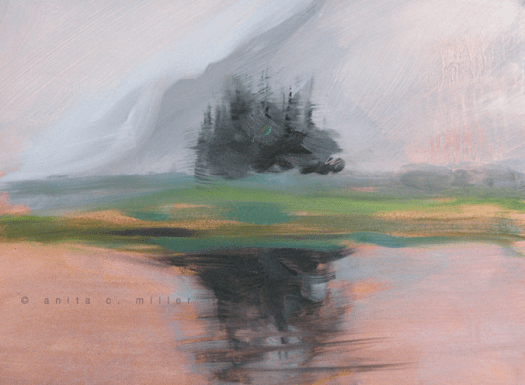
A peaceful spot where I often like to walk.

oil on archival panel
© Anita C. Miller 2013
oil on archival panel
© Anita C. Miller 2013
oil on archival panel
© Anita C. Miller 2013
oil on archival panel 6″ x 6″
© Anita C. Miller 2013
oil paint on archival panel
© Anita C. Miller
oil on archival panel
© Anita C. Miller 2013
oil on archival panel
© Anita C. Miller 2013
___
Some marks in this painting are scratches back through the paint (sgraffito).
oil on archival panel
© Anita C. Miller 2013


oil on archival panel
© Anita C. Miller

oil on archival panel
© Anita C. Miller 2013
oil on archival panel
© Anita C. Miller 2013

oil on archival panel
© Anita C. Miller 2013

oil on archival panel
© Anita C. Miller 2013
___
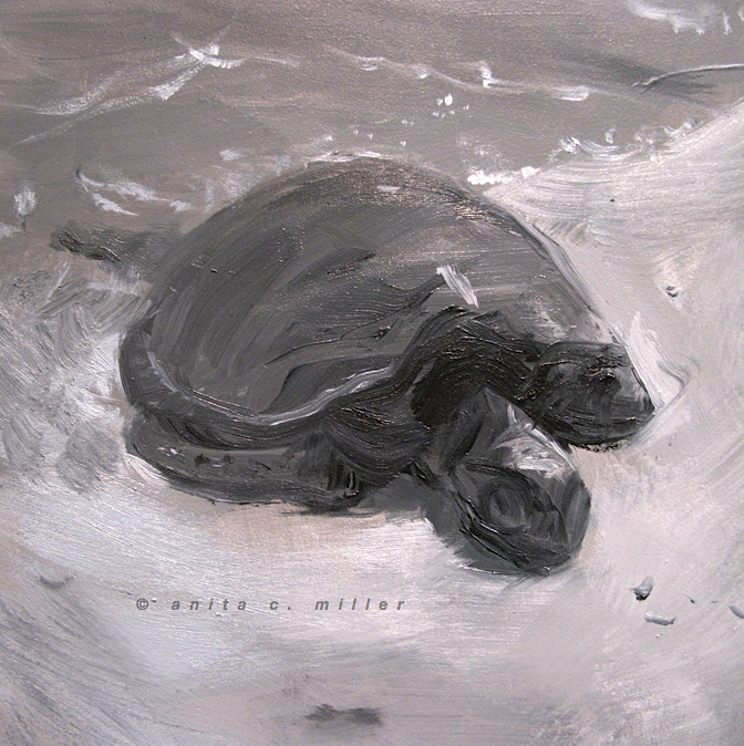
When my husband and I visited Oahu recently, this gorgeous Hawaiian Green Sea Turtle came up on the beach. We were about the first people to see him and I got a few photos before the naturalist roped off the area. It was interesting to learn that this particular turtle often comes ashore to rest on this beach. Such a special moment to see this creature in the wild!

oil on archival panel (Gessobord) 5″ x 5″ x 1/8″, unframed
© Anita C. Miller
___
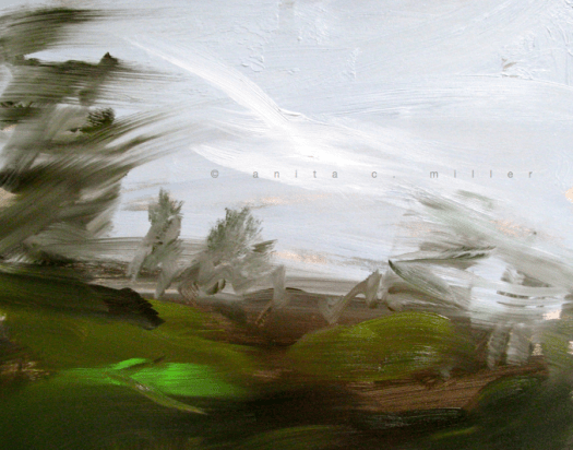
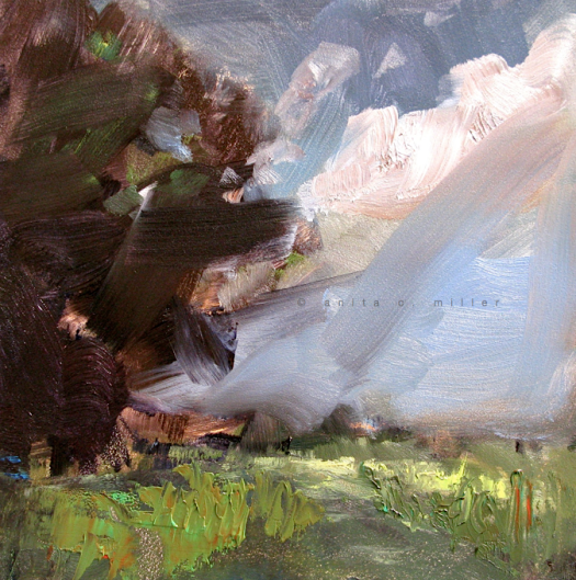
I liked putting in the texture for the grasses and scraped through the paint (sgraffito) for added texture. The sky, on the other hand, is quite smooth.

You must be logged in to post a comment.